Illinois State University’s FCS 368/468 Fashion Promotion Course
By: Cherrie Herberg
Good v.s. Bad Round #1
Friday February 7th
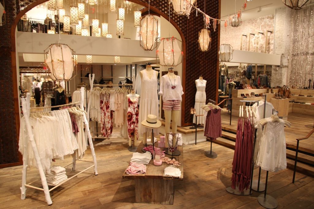
The top picture is an excellent example of visual merchandising. The image shows many core design tools and strategies, such as elements of design. Just by viewing the image it is easy to point out color, texture, direction, line, shape, sequence, and tension. Color scheme is extremely prominent in the above image; maroon, blush, white and cream are colors that harmonize well together. Tension is shown through the use of lighting, the technique used helps the color scheme create harmony. Tension is also visible throughout the architecture of the store and the display pieces used. Visual merchandising is used to tell consumers a story about what their life may be like if they were to wear the garments on display. In the image above, the story visual merchandisers are relaying is a comfortable bohemian lifestyle.
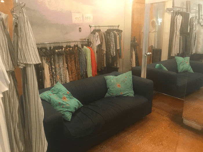
The bottom picture is an example of a bad fashion retail display. This display doesn’t tell a story, nor does it tell consumers how to wear the products for sale. This image has no color scheme or harmony. The lighting is dull and unflattering to the products. When viewing this image it is easy to see that it would be difficult for customers to reach the product because the garments are inaccessible. The products being sold should be the center of attention, nothing should stand in the way of getting the product into the customers hands.
The bottom image is an example of a bad retail display. This display is trying to tell a story, but the story is unclear due to the lack of a focal point. There is no apparent color scheme or harmony being used in this display. It is hard to notice balance in this display. The story being told in this display explains two different scenarios, it makes it hard for the consumer to understand exactly what types of products the story carries.
Good v.s. Bad Round#2
Friday February 14th
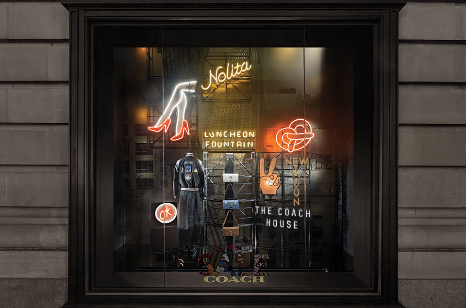
The top image is a great example of a visual merchandising window display. This Coach display tells the consumer the story of where Coach originated. The display has many characteristics describing New York City. The city has influenced not only the widow but the merchandise being displayed. The color scheme used is black and grey with pops of color. They mixed neutrals with red and yellow to showcase “the city that never sleeps”. Tension is shown through the neon lights and the backgound displaying a building. The 3-D effects of the fire escape ladder is a great example of adding texture to a 2-D backdrop.
Good v.s. Bad Round#3
Friday February 28th
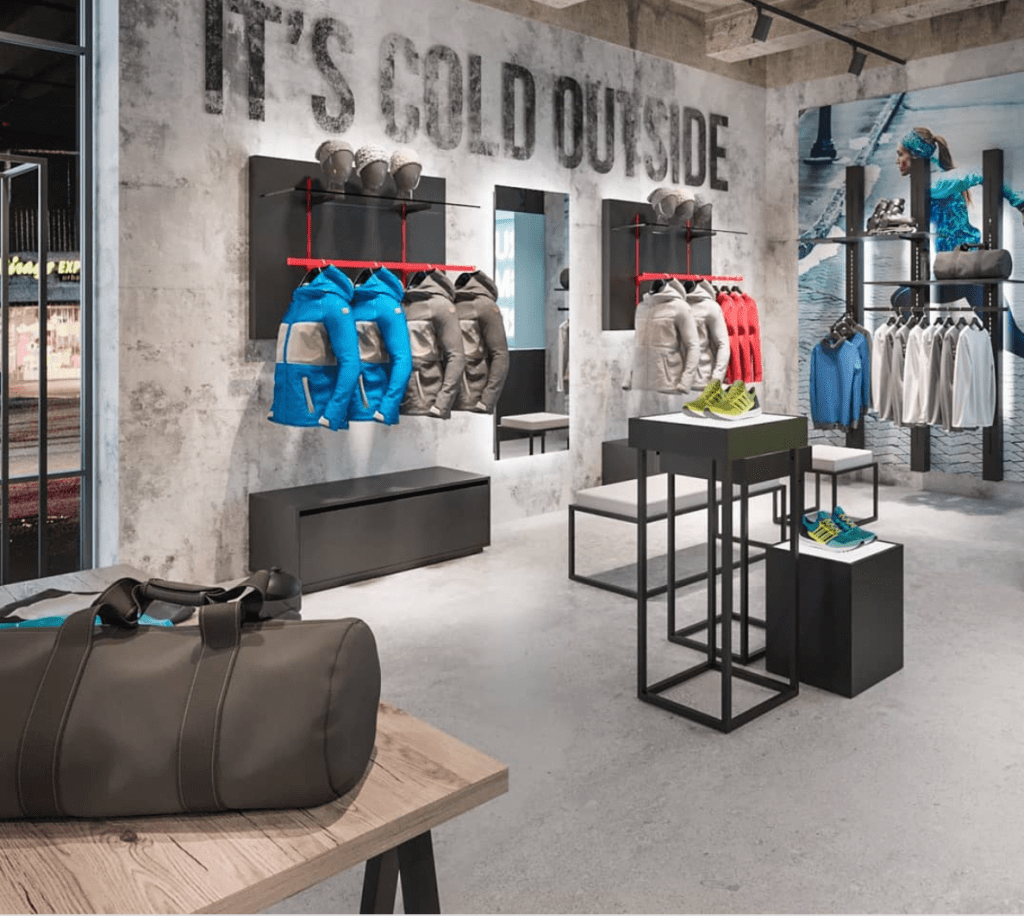
The top image to the right is a good example of visual merchandising because it has a strong theme and a balanced design. The components of the shop are right in line with the story the retailer is selling. Tension has been added through the white lighting. The lighting effects the consumers sense of sight, making them think of the bright refection the sun has on snow. There is texture on the “It’s Cold Outside” quote on the wall. The splotched white over the quote creates an illusion of snow blowing in the wind. The fixtures on the back wall tells the consumer the story they can live if they wear this winter athletic gear. This brand has created a great display that harmonizes well because of the color scheme and props used. The fixtures add a modern appeal to the overall look of the brand.
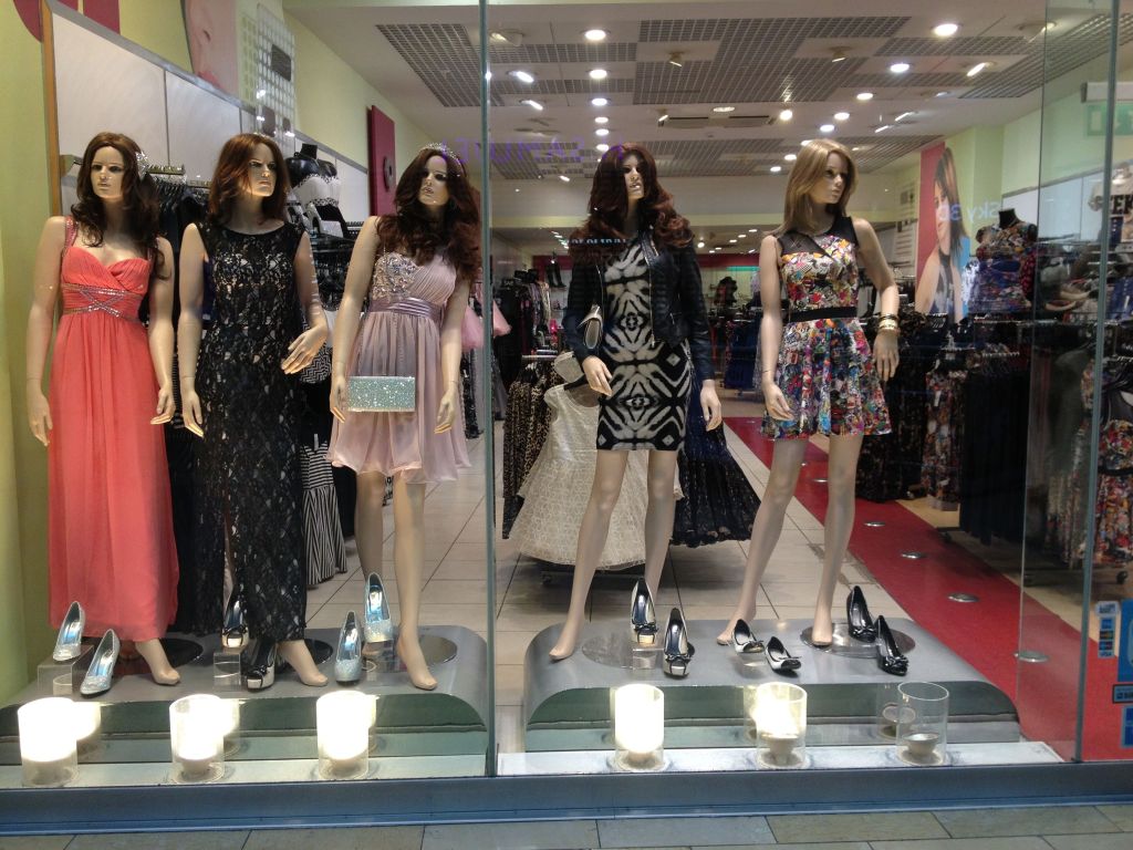
The image above is an example of a bad retail display. There is no color scheme or rhythm to the window display. There are no props to tell a story, nor is there a background to divide the window display from the rest of the retail space. The lights at the bottom of the window display do not flatter the mannequins or the outfits presented on the mannequins. This display looks like a thrown together mess, with no story line or focal point.
